Web Design
REDESIGN landing savings accounts
BANCOESTADO DE CHILE
Creative process
The general process I worked on in this quick re-design challenge was design thinking because it is a user-centered design process that allows to innovate a product at a marginal and incremental level, for this challenge I took the first three steps of the design thinking process.
1. Empathize
I started by empathizing and looking at the current context
of the acquisition flow of a bank account, which allowed me to better understand the process.
2. Research and think of solutions
I then moved on to the phase of detecting opportunities for improvement.
opportunities for improvement. Thanks to the benchmark I did, I was able to detect design and user behavior patterns.
3. Thinking solutions
Finally I continued with the phase of generating new ideas thinking about a redesign with better user experience and usability. Always having an out of the box and creative thinking.

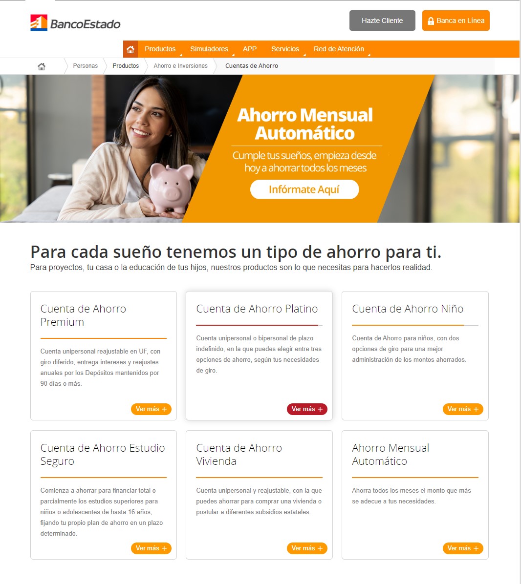
current version
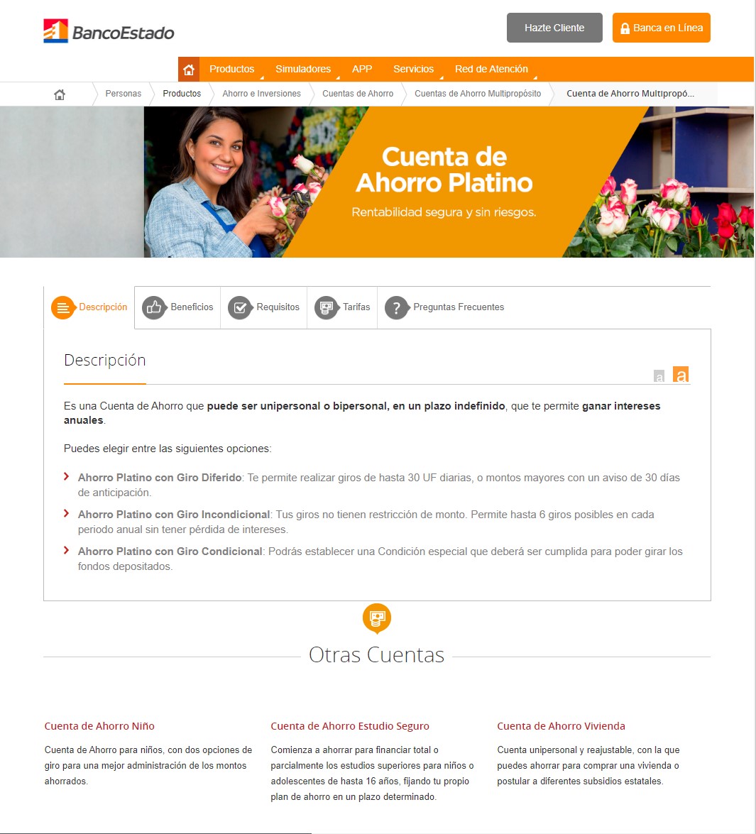
We see below the current version of the information flow of the different savings accounts offered by the bank, and their respective detail of each one. We are going to redesign these two landing pages.
Landing Accounts
Landing Detail Accounts
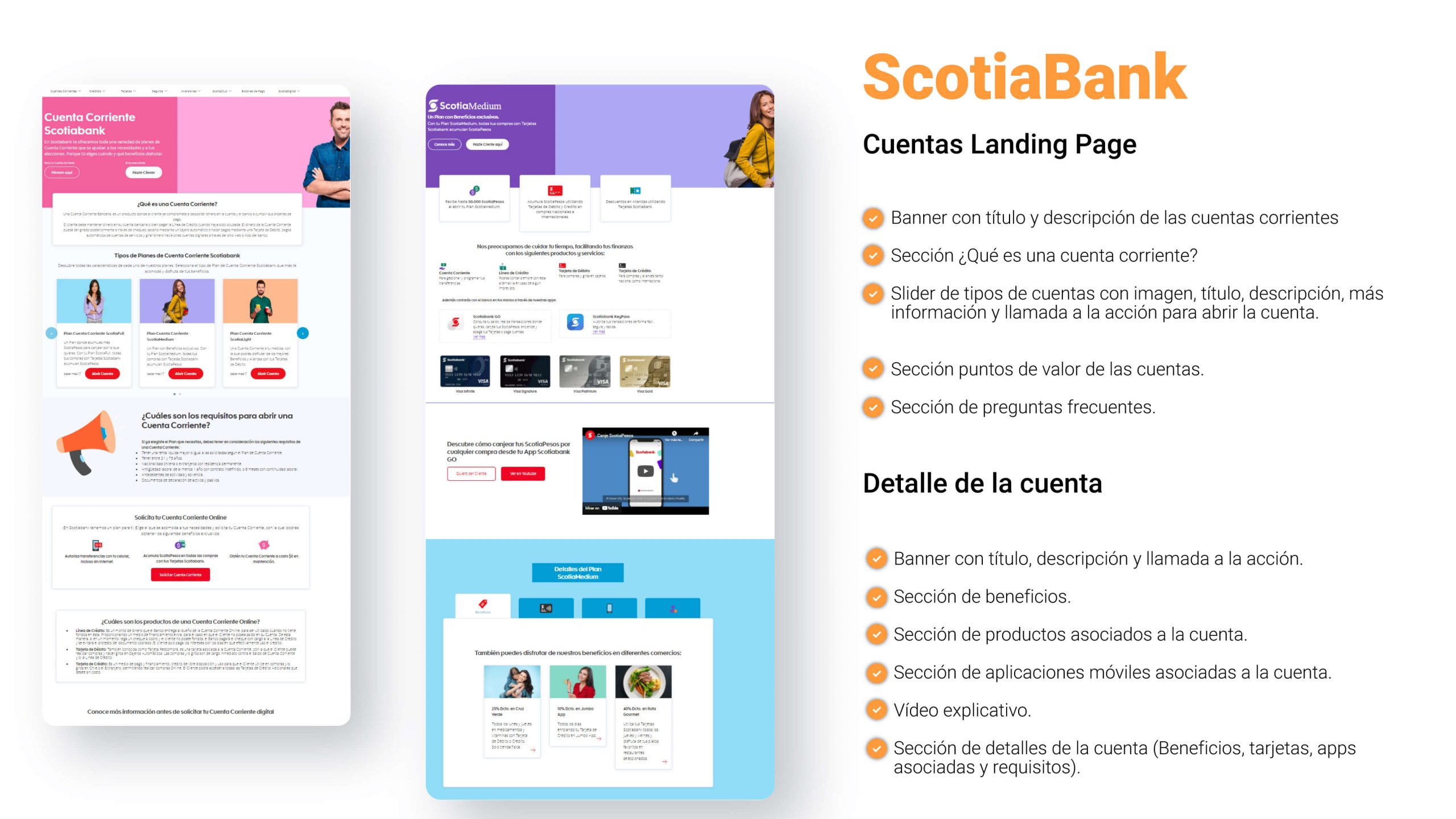
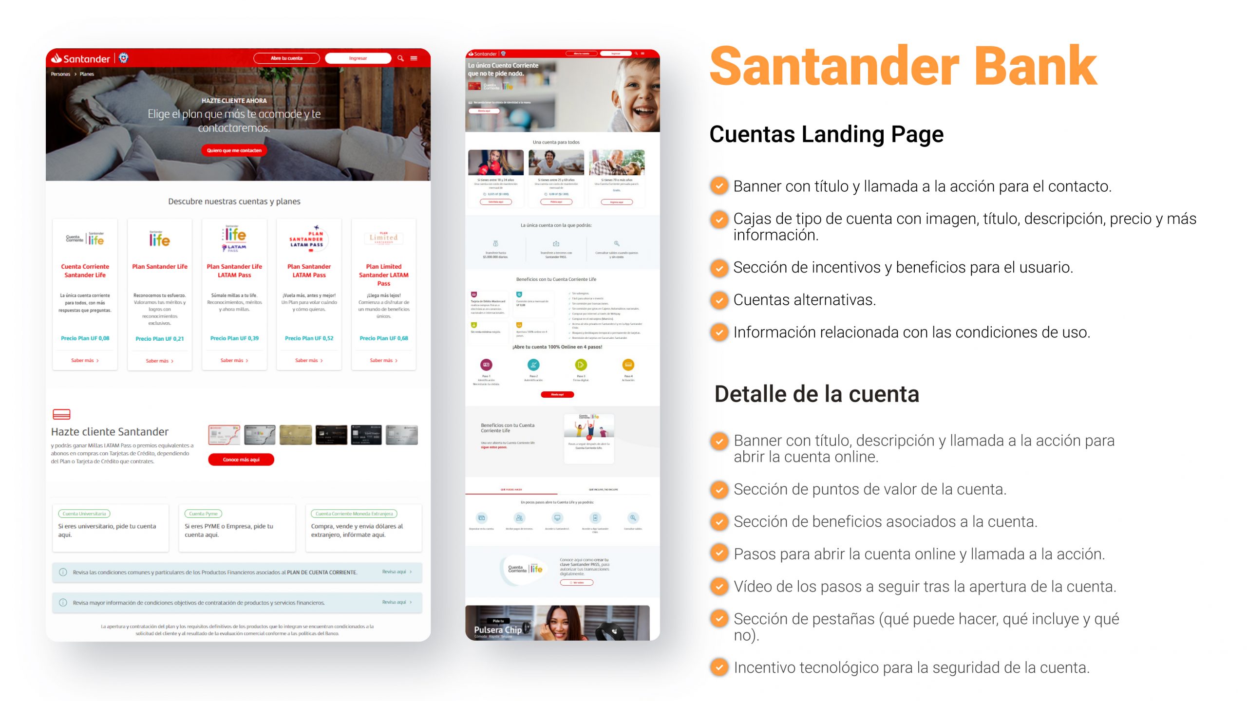
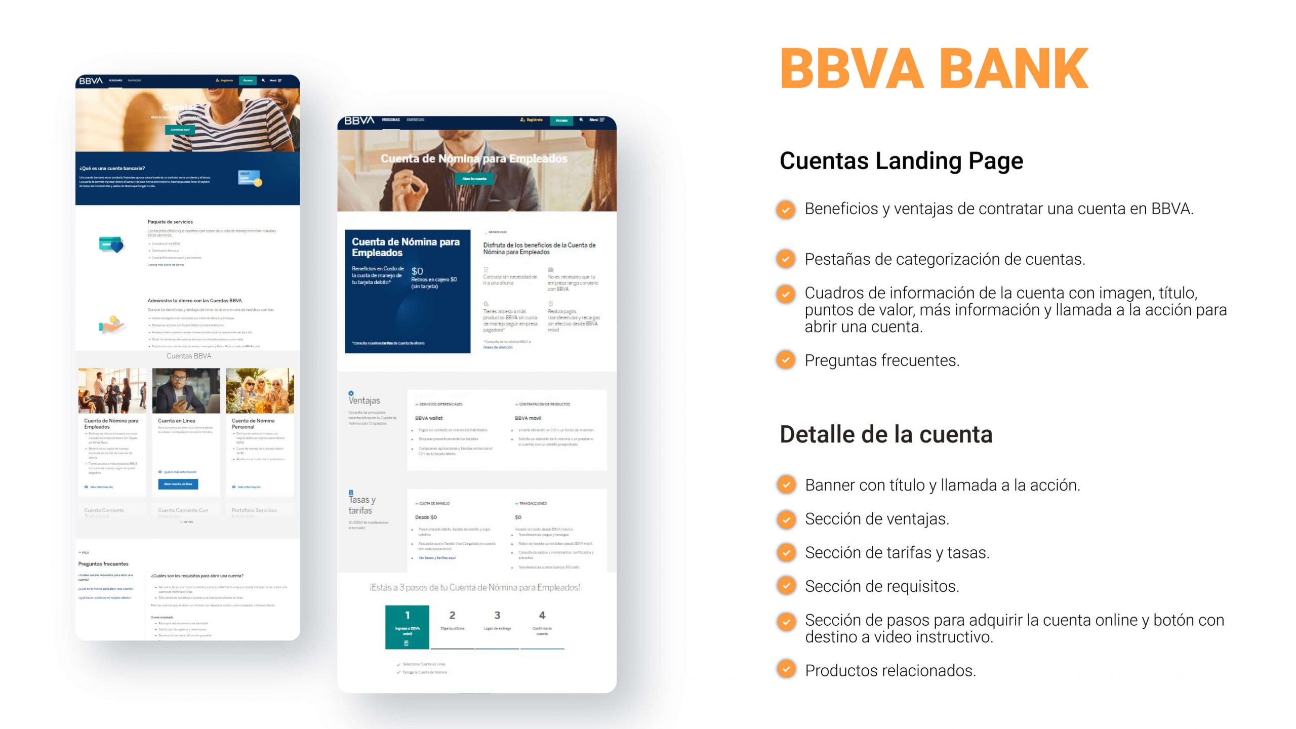
benchmark
We will use the Benchmark research method to find out a little about our competition and what ideas we can come up with to stand out to the bank’s customers.
What works and what doesn’t?
Some cases allow the user to create their bank account from home, easily and online, which allows for greater engagement through agile processes. The benefits of each of the accounts combined with the technological features, give a great added value, increasing the possibility of conversion.
the possibility of conversion.
In some cases, at the beginning of the landing of the account, the user is invited from the first moment to open a bank account, this does not work very well because we must tell a narrative to the user, starting by presenting the product, telling its value points and then invite the user to buy the product.
What are the minimum expectations?
- Component where the accounts available to the user are displayed with: Title, description, image, “More information” button, “Open account” button.
- User help component and frequently asked questions.
- In the detail of the accounts should be presented information such as: features, benefits, requirements and documentation.
- Steps to open an account.
What patterns are repeated?
- A banner at the top of each page is a pattern that is constantly being
constantly, to give the user preliminary information about what is coming next. - Also very repetitive is the way of presenting the bank accounts, which are integrated in boxes where information such as: title, description, image and “More information” are collected.
- There are sections where much emphasis is placed on the advantages and points of value that the account brings to the user.
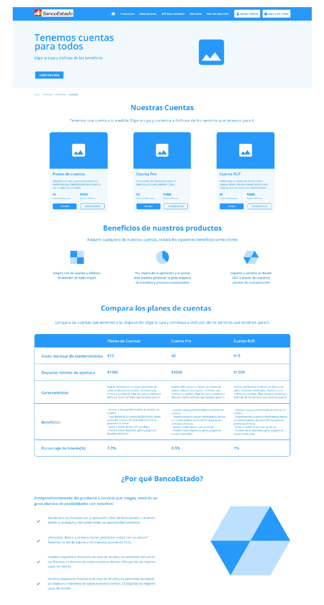
Wireframe Landing Accounts Proposal
First Section
The initial banner is maintained, but a new image is proposed that has more connection with the user and is also wider in space. We also added a “call to action” with the action of scrolling to the “our accounts” section to encourage the user to get to know the product.
Second Section
In the “our accounts” section, a new design pattern is made, where an allusive image is added to each one to generate empathy, the title and description are maintained, however two key data are added at first sight which are “Interest” and “Price per month”, which will allow a better context to the interested user. Finally, two buttons have been added to replace the arrow icon, giving the possibility to learn more information about the account or take the user to purchase the banking product at once, saving the user the step of going to the detail page.
Third Section
I have decided to add a new section which are the benefits of banking products, to offer an added value to the user, if he/she acquires any of the bank accounts.
Fourth Section
One of the most important ideas for this redesign is to add a comparative table that will be very useful for the user as a guide to make the best decision when choosing a bank account. With key data such as maintenance cost, minimum deposit, particular advantages and interest rate.
Fifth Section
Finally, I wanted to add the section Why BancoEstado, which is the added value that BancoEstado gives to its clients compared to other banks, because we have to demonstrate that BancoEstado is the best option for people in the market.
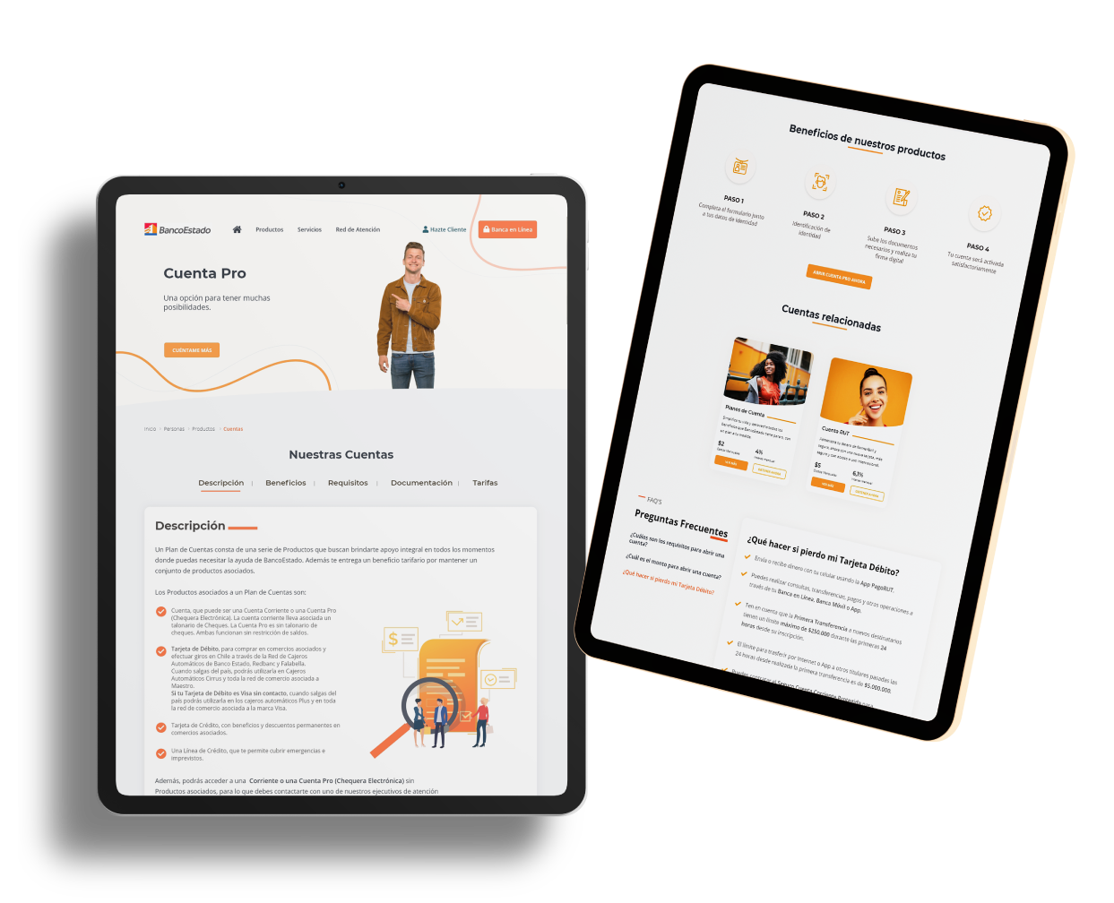
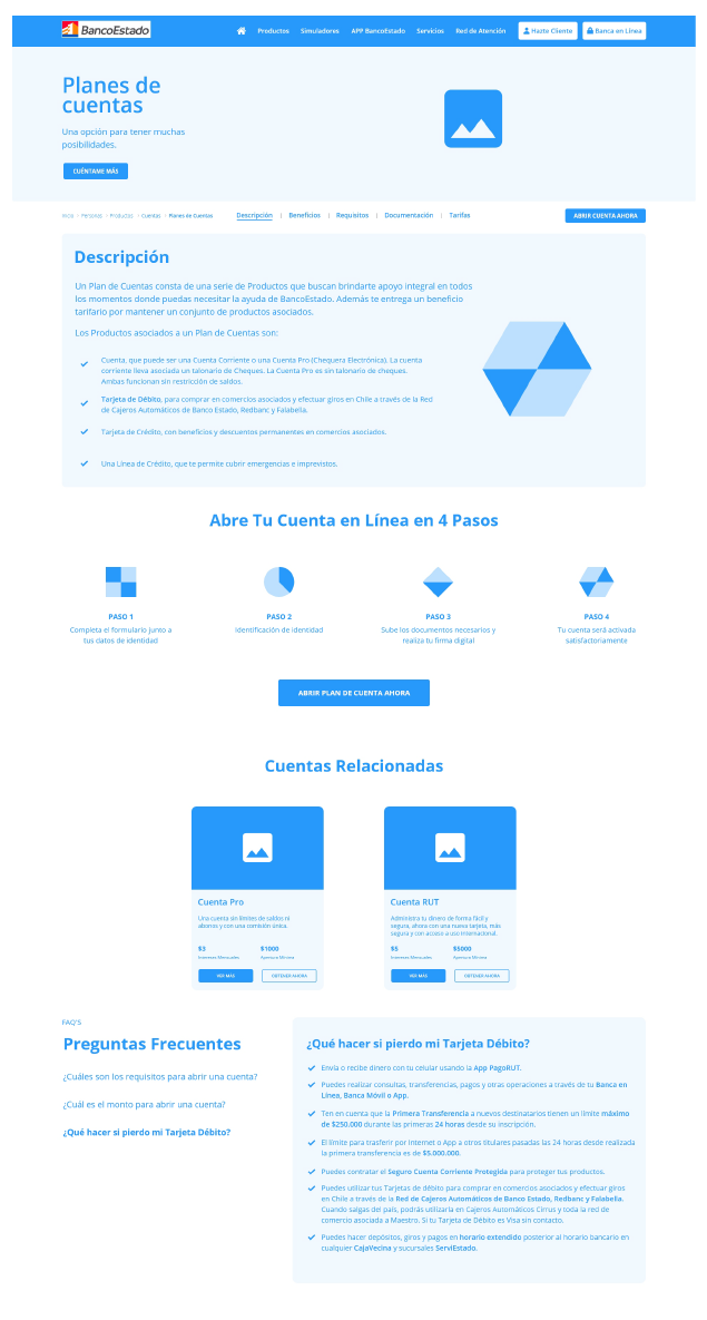
Wireframe proposal detail account
First Section
The initial banner is maintained, but a new image is proposed that has more connection with the user and is also wider in space. We also added a “call to action” with the action of scrolling to the “our accounts” section to encourage the user to get to know the product.
Second Section
The format of the initial component is maintained but with a new design, having in the upper part a submenu where we find titles such as description, requirements, benefits, documentation and rates. In the lower part, detailed information is shown when changing section in the submenu, in each section of information an image or illustration is shown to generate dynamism in the interface. In addition, an “Open account now” button is added, taking into account that the button will be in that position at all times even when scrolling, to motivate the user to get an account at any time.
Third Section
It is very important to communicate to the user that opening an account at BancoEstado is very easy, and does not generate complex processes. That is why we have created this section where we show the 4 simple steps that the user will follow. After showing how easy it is to open an account, we show the button.
“Open account plan now” button to take the user to the beginning of the process of acquiring the bank account.
Fourth Section
We keep the same design pattern of the previous page, where in this section we give a direct access to the user to go to the details of the Pro account and the RUT account without the need to go back.
Fifth Section
The FAQ section is very important, because it is where we collect the most common doubts and concerns and we have the opportunity to solve people’s doubts quickly. Following the principle of usability of help and documentation.
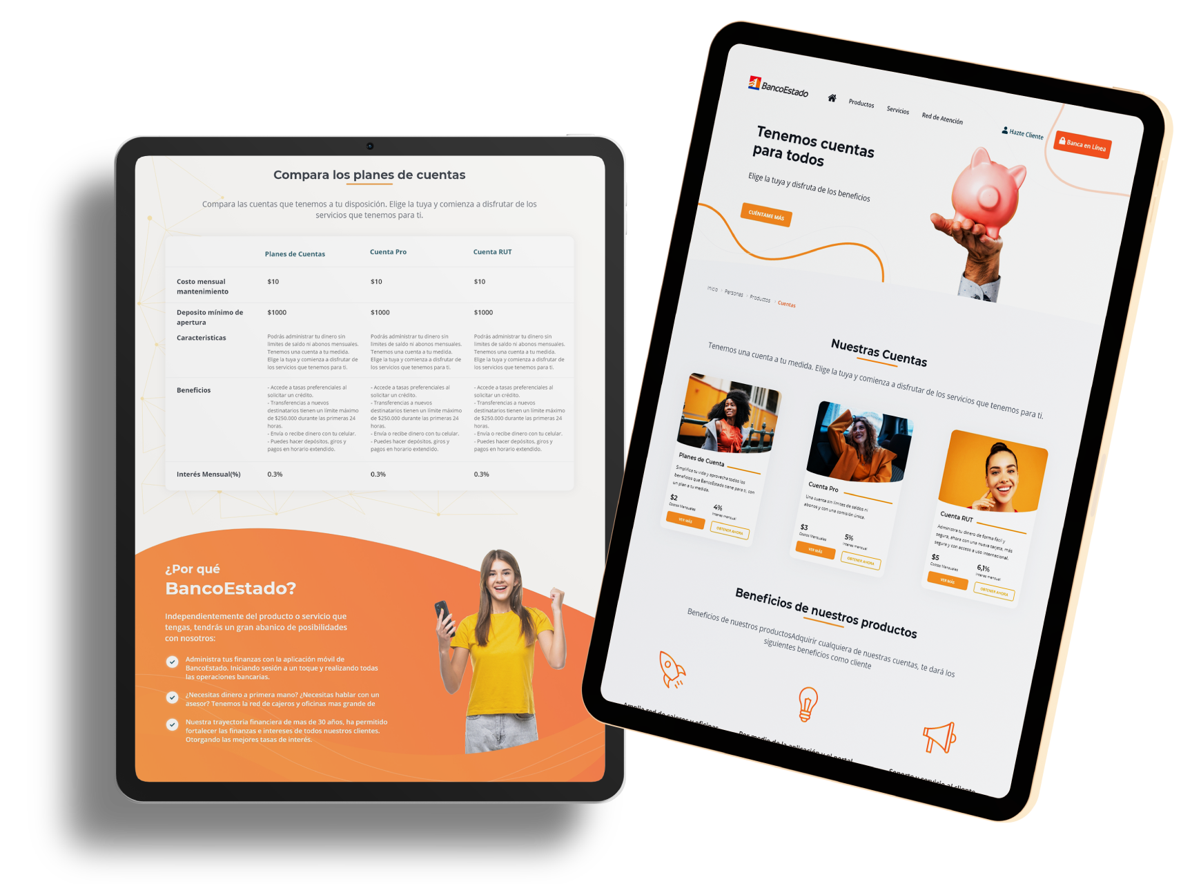
Account detailMock up landing
High Fidelity Prototype
